NOISY BENCH logo story
During the HNC, one of the assignments was to create a production company logo and animate it on Adobe After Effects.
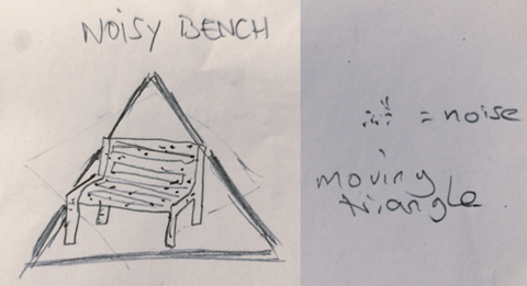
For some reason, I had “Noisy Bench” early in the logo development process. It is a (bad) pun with Noisy Bunch. Noisy aurally and visually.
First, I had to define the bench. Would it be a picture, a drawing? Realistic? I don’t have many softwares to draw on my laptop and I thought of vector graphics. I found Vectr, a free online software. I draw the whole logo with it.
I first thought of a square, diamond or triangle for the background.
However, while drawing the background on Vectr, the circle imposed itself. Being an 80/90’s kid, I also wanted flashy colours that would reflects the fluorescent and neon colours of the time. I tried neon blue and pink, mainly because I like those colours, and found they went well together. I added some purple to the lot. The words are in the same colours, so it looks consistent.

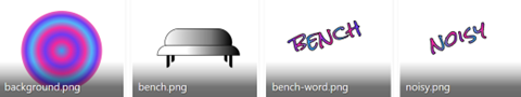
Once I had the logo done, I drew and saved the separate elements (background, bench, “noisy”, and “bench”. I then animated the whole thing on AfterEffects.
The bench is supposed to be noisy so after the first draft I added noise on AE as well as a short mp3 of white noise.

Post a comment